Perfecting those pixels

In my recent developing adventures, my adjacent sibling suggested I try out this Chrome Extension: PerfectPixel

OddsMonkey free trialThis extension lets you overlay an image of your final site over the page rendered in the browser. For example, if you are working in Photoshop, save the whole page as a png/jpg, then use the extension and load the image. You can then pick a reference point and see where you need adjustments. I use Developer Tools (F12) to edit and adjust, then make the changes in my code.

Really cool!

Photoshop Extension Love

Hi folks! Happy Holidays. I hope your Thanksgiving weekend was wonderful.

I wanted to share with you something I found in my research for a big project I am working on. (I hope I can share with you soon!)

In trying to find an easy way to convert a gradient from image to code, I stumbled upon CSS3Ps

It is a wonderful time saver and the results are lovely.

Enjoy!

http://css3ps.com/

Look to the Sky – background-size and custom fonts

The background-size property is the primary focus of this exercise. I was inspired by the album cover from The Neighbourhood album I Love YouI was thinking it had a simple portfolio landing-page look, so I used it as my inspiration for this project.

sky_final

I used a great, large sky image that I optimized in Photoshop and lovely icons from IcoMoon. I customized the icons used in this project to be entered as fonts. This will let me easily change the style (especially hover effects) on each of the icons.

Here is the HTML to start.

HTML:
<ul>
<li>
<a class="icon earth" href="#">e</a>
</li>
<li>
<a class="icon heart" href="#">h</a>
</li>
<li>
<a class="icon gift" href="#">g</a>
</li>
</ul>

Now that the HTML is setup, lets look at the CSS.

I am using a font import from IcoMoon in the CSS, which has fairly wide support, except for IE 8 and prior.

I’ll declare my custom font name and source by using @font-face.

CSS:
@font-face {
font-family: "Into Open";
src: url('Into Open.ttf'),
url('Into Open.eot');
}

Then, I added the font-family to my links.

CSS:
.earth,
.heart,
.gift {
font-family: "Into Open";
font-size: 4em;
}

Then, I add the background using background-size with a value of cover. The value cover will make the background scale as it is resized. Set the following up and re-size your browser, pretty great!

CSS:
html {
background: url('imgs/sky.jpg') no-repeat center center fixed;
-webkit-background-size: cover;
-moz-background-size: cover;
-o-background-size: cover;
background-size: cover;
}

I used a general reset on this project and added a color to the links.

CSS:
* {
padding: 0;
border: 0;
outline: 0;
margin: 0;
}


a {
text-decoration: none;
color: #999999;
}


li {
list-style: none;
}

Now, to position the icons. First, I made the three icons positioned absolutely to the document. And since positioned absolute, I set them 45% from the top.

CSS:
.earth,
.heart,
.gift {
position: absolute;
top: 45%;

Next, I set each icon to be a percentage from the left.

CSS:
.earth {
left: 25%;
}


.heart {
left: 50%;
}


.gift {
left: 75%;
}

The icons are positioned just how I would like, now to format the icons when hovered.

CSS:
a:hover {
color: #2c2c2c;
}

I also went back to the link style and added a transition which it gives the hover a slower color change. Less snappy.

CSS:
a {
transition: .5s
}

And that will do it for now. See you next time.

Live code to play:
CodePen

References:
MDN

Git, Thinking About It

One of the things I found most frustrating about Git, the most popular of version control systems, was simply trying to understand what it was.  People would tell me about tagging, forking, merging, cloning, conflicts, branching… it was all very confusing.  I wish there was something out there that gave a “for Dummies” intro to Git without getting into the nitty gritty.  No code, no diagrams, no confusing jargon.  Just the basics.

So, I wrote one.

Git, simply, is a way to write code with others, without getting in anyone else’s way.

First, you have to grab the code you want to work with.  In the biz, this pile of code is called a repository, or repo.  To get your copy, you clone the repo.  And that’s exactly what you are doing; getting an exact copy of the code that you can alter on your own environment.

But what if you make changes to the same file someone else is in?  This will generate conflicts.  Oh no!

Git is smart enough to know this will happen.  Think, for a moment, about a dance.  Stepping on each other will happen.  Git allows you to gracefully handle those mistakes.  Instead of tumbling to the ground during your Brazilian Tango, you can stutter-step and continue on.  Git tells you about those conflicts and it will allow you to merge your file to the ones in the original pile of code.

Once you’ve made your corrections, your conflicts are resolved.  You can then commit your changes to the original pile of code.  Committing is like printing a shipping label: you haven’t sent it yet, but you’re ready! Once you commit your code, you have to push it out to the original pile of code.  That’s the equivalent of dropping that package in the mail box.

And really, that’s it.  That’s the worst of it.  You get some code, you change some code, and, if there are no problems, you send your changes back to the original.

There are, of course, more intricacies and nuances that I didn’t cover, but when you are starting with Git, that’s what you need to know.

Making a menu – Part III – Borders & Box-shadow

In my third and final article, I am going to add the final touches to my menu. To recap:

Part I – Building the menu

menu

Part II – Adding the gradient

gradient_menu

Part III – Border-radius, box-shadows, and final touches

final_menu


I am going to review the box-shadow and border-radius, then look at the final touches to polish up menu.

First, I added the border-radius and spaced the menu a bit further down the page to give me room to create the the box-shadow.

CSS:
border-radius: 10px;
margin: 40px auto;

Then, I added several box-shadows. The order in the code, top to bottom, displays on the page from the inside out. Note, that each shadow is separated by a comma. I left the box-shadow prefix free (some commentary on this).

CSS:
box-shadow: 0 0 10px #999999,
0 0 0 10px #dedede,
0 0 0 12px #ffffff,
0 0 0 14px #999999,
0 0 15px 16px #b3b3b3;

And that is giving us the basic menu we are looking for. Now, I will add some of the final touches.

I kept the drop-down separate from the styling above and just added a border-radius to keep with the theme.

CSS:
.nav li:hover ul {
border-radius: 10px;
}

I then added a bit more padding to the unordered lists.

CSS:
ul {
padding: 15px;
}

I noticed that the padding between list items was fine, except the first-child was double the padding. I went back and added an adjacent sibling selector for .nav > li to correct the spacing issue.

CSS:
.nav > li + li

I modified the color of the text when hovered:

CSS:
.nav a:hover {
color: #000000;
}

And the last polish item I added was text-shadow.

CSS:
text-shadow: 0 1px #eeeeee;

Looks great! final_menu

I had a lot of fun setting this up and I hope you enjoyed the process! Take a look at the Live Demo and experiment with the colors of the box-shadow.

Thanks for tuning in and see you next time.

References:
CSS3.info
MDN

Making a Menu – Part II – Gradients

Hi there. This post is going to cover adding a gradient to our menu from Part I.

This is what the final menu will look like after Part III:

final_menu

And here is what the gradient will look like added to my menu, after we wrap up Part II:

gradient_menu

A note about browser support: IE 10 and current versions of Chrome, Firefox, Safari, and Opera support CSS gradients. IE 9 and prior IE versions do not. To add gradients to prior IE versions, check out filter

A couple of non-gradient style items:

I added a defined width to the menu because we are going to be looking at border-radius and box-shadows in Part III. I also centered the menu to be able to view it easier. I also added a bit of padding so the gradient fills the space.

CSS:
.nav {
width: 800px;
margin: 0 auto;
}

ul {
padding: 5px;

For the gradients, first I set a fallback background-color (for older browsers and instead of using filter for IE). This is a color I am using in the gradient and will look just fine if gradient is not supported in the users browser.

CSS:
background-color: #dedede;

Now, I am going to add the color stops, or the colors that are going to show in my gradient. I just want two color stops, a light gray (#dedede) and a darker gray (#b3b3b3).

You can add as many colors as you need, the direction of the gradient, as well as the percentage of space each color occupies. These are separated by a comma. Also, keep in mind I am covering a basic linear-gradient here, but you can also use radial-gradient and repeating gradient as the need arises.

CSS:
background-image: linear-gradient(#dedede, #b3b3b3)

But I cannot forget the vendor prefixes that will help my gradient look the way I intend, on older browsers.

CSS:
background-image: -webkit-linear-gradient (#dedede, #b3b3b3);
background-image: -moz-linear-gradient (#dedede, #b3b3b3);
background-image: -ms-linear-gradient (#dedede, #b3b3b3);
background-image: -o-linear-gradient (#dedede, #b3b3b3);

And viola! Check out the live code here.

gradient_menu

I used several resources in building this article including:
gradients on MDN
gradient generator

Making a Menu – Part I – The Menu

This starts my three part series of creating the following menu:

final_menu

My first post will be creating the basic menu, the next post will be adding in gradients, and the third and final post I will add border-radius and box-shadows, as well as some polish, to finish it up.

Here we go!

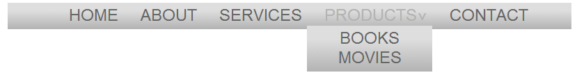
I am going to examine the building blocks of a simple menu. Including, making the menu horizontal, creating a hover effect that includes showing the nested ul (drop-down), changing the appearance of the menu, and looking at the other dynamic pseudo-classes.

menu

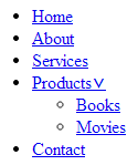
Our basic HTML is as follows, a short list of menu items and one nested ul element that will be used to create a drop-down menu.

HTML:

html

Click the above image to view the markup, as well as follow along with the CSS below.

Now, lets get to styling the menu.

I started with the a element, removed the underline, made the text uppercase, set my font size and style, and defined the text color. When you are working through styling your menu, adjust this to your liking!

CSS:

a {
text-decoration: none;
text-transform: uppercase;
font: 24px "Avant Garde", Avantgarde, "Century Gothic",
CenturyGothic, "AppleGothic", sans-serif;
color: #666666;
}

For the li element, I removed the bullet points:
li  {
list-style: none;

Since unordered list items are block elements, to create the horizontal menu, we will change the display property to inline.
display: inline;

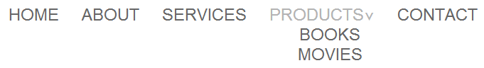
My menu is starting to take shape. Now lets align the text:
.nav {
text-align: center;
}

Next, I set left padding to the list elements that are direct children (>) of the nav class and have adjacent siblings (+):
.nav > li + li {
padding-left: 25px;
}

Now to start positioning. I made the list elements of  the nav class set to relative position. This is to use later for absolute positioning of the drop-down list.
.nav li {
position: relative;
}

.nav ul {
position: absolute;

Now I can use the absolute positioning to my advantage and hide the nested list items. To do this, I used the left property.
Many articles are published about why you should not use the display: none property, so I won’t rehash them here. I’m not using it.
left: -9999px;

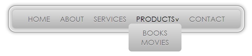
Alright! The menu is looking pretty good.

Now I will use the following hover pseudo class to bring the nested ul back into view. This works by taking the unordered list and positioning it left: 0; when hovering on the nav class li element, bringing it back into view.
.nav li:hover ul {
left: 0;
}

Last, I will make the menu items respond when hovering by changing the color to the a tag.
.nav a:hover {
color: #b3b3b3;
}

There we have it! Next up, gradients.
menu


Check out the code here: Live Demo