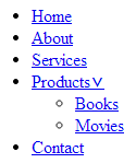
This starts my three part series of creating the following menu:
My first post will be creating the basic menu, the next post will be adding in gradients, and the third and final post I will add border-radius and box-shadows, as well as some polish, to finish it up.
Here we go!
I am going to examine the building blocks of a simple menu. Including, making the menu horizontal, creating a hover effect that includes showing the nested ul (drop-down), changing the appearance of the menu, and looking at the other dynamic pseudo-classes.
Our basic HTML is as follows, a short list of menu items and one nested ul element that will be used to create a drop-down menu.
HTML:
Click the above image to view the markup, as well as follow along with the CSS below.
Now, lets get to styling the menu.
I started with the a element, removed the underline, made the text uppercase, set my font size and style, and defined the text color. When you are working through styling your menu, adjust this to your liking!
CSS:
a {

text-decoration: none;

text-transform: uppercase;

font: 24px "Avant Garde", Avantgarde, "Century Gothic",
CenturyGothic, "AppleGothic", sans-serif;
color: #666666;
}
For the li element, I removed the bullet points:
li {
list-style: none;
Since unordered list items are block elements, to create the horizontal menu, we will change the display property to inline.
display: inline;
My menu is starting to take shape. Now lets align the text:
.nav {

text-align: center;

}
Next, I set left padding to the list elements that are direct children (>) of the nav class and have adjacent siblings (+):
.nav > li + li {

padding-left: 25px;

}
Now to start positioning. I made the list elements of the nav class set to relative position. This is to use later for absolute positioning of the drop-down list.
.nav li {

position: relative;

}
.nav ul {

position: absolute;
Now I can use the absolute positioning to my advantage and hide the nested list items. To do this, I used the left property.
Many articles are published about why you should not use the display: none property, so I won’t rehash them here. I’m not using it.
left: -9999px;
Alright! The menu is looking pretty good.
Now I will use the following hover pseudo class to bring the nested ul back into view. This works by taking the unordered list and positioning it left: 0; when hovering on the nav class li element, bringing it back into view.
.nav li:hover ul {

left: 0;

}
Last, I will make the menu items respond when hovering by changing the color to the a tag.
.nav a:hover {

color: #b3b3b3;

}
There we have it! Next up, gradients.

Check out the code here: Live Demo

