In my third and final article, I am going to add the final touches to my menu. To recap:
Part I – Building the menu
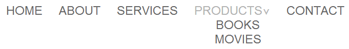
Part II – Adding the gradient
Part III – Border-radius, box-shadows, and final touches
I am going to review the box-shadow and border-radius, then look at the final touches to polish up menu.
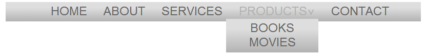
First, I added the border-radius and spaced the menu a bit further down the page to give me room to create the the box-shadow.
CSS:
border-radius: 10px;
margin: 40px auto;
Then, I added several box-shadows. The order in the code, top to bottom, displays on the page from the inside out. Note, that each shadow is separated by a comma. I left the box-shadow prefix free (some commentary on this).
CSS:
box-shadow: 0 0 10px #999999,

0 0 0 10px #dedede,

0 0 0 12px #ffffff,

0 0 0 14px #999999,

0 0 15px 16px #b3b3b3;
And that is giving us the basic menu we are looking for. Now, I will add some of the final touches.
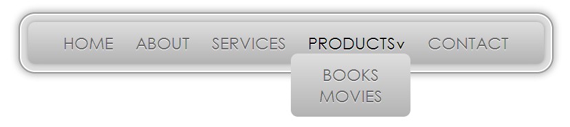
I kept the drop-down separate from the styling above and just added a border-radius to keep with the theme.
CSS:
.nav li:hover ul {

border-radius: 10px;

}
I then added a bit more padding to the unordered lists.
CSS:
ul {

padding: 15px;

}
I noticed that the padding between list items was fine, except the first-child was double the padding. I went back and added an adjacent sibling selector for .nav > li to correct the spacing issue.
CSS:
.nav > li + li
I modified the color of the text when hovered:
CSS:
.nav a:hover {

color: #000000;

}
And the last polish item I added was text-shadow.
CSS:
text-shadow: 0 1px #eeeeee;
Looks great!
I had a lot of fun setting this up and I hope you enjoyed the process! Take a look at the Live Demo and experiment with the colors of the box-shadow.
Thanks for tuning in and see you next time.