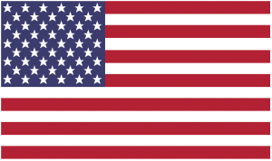
In a practical attempt to use stars, I wanted to put together this American flag.
I used CSS stars (created here), positioning, and the z-index.
Good ol’ American flag:
Check out the code here: live demo
Now that we know how triangles work, lets see something fun: stars!

I started with three triangles to create a five-pointed star.
HTML:
<div class="star">

<div class="star-body"></div>

<div class="star-left"></div>

<div class="star-right"></div>

</div>
I adjusted the length of the sides of the triangle by changing the border-width property. The top border being longer and the right/left and bottom borders being shorter.
CSS:
.star-left {

border-top: 80px solid transparent;

border-right: 45px solid #3366ff;

border-bottom: 50px solid transparent;

}
.star-right {

border-top: 80px solid transparent;

border-bottom: 50px solid transparent;

border-left: 45px solid #3366ff;

}

Then I used the transform property, rotate.
Support: transforms are supported in IE 9, Chrome, Safari, and Opera (all with prefixes) and Firefox version 16 to current.
I am using rotate to adjust the narrow triangles. That way the shape of the star will start to form.
CSS:
On the right pointing triangle:
-webkit-transform: rotate(19deg);

-moz-transform: rotate(19deg);

-ms-transform: rotate(19deg);

-o-transform: rotate(19deg);

transform: rotate(19deg);
On the left point triangle
-webkit-transform: rotate(-19deg);

-moz-transform: rotate(-19deg);

-ms-transform: rotate(-19deg);

-o-transform: rotate(-19deg);

transform: rotate(-19deg);

Then, I set the containing div to a position of relative and the body, left, and right triangles to a position of absolute so they lay on top of each other.
Side note: as I started to position, I had to go back and adjust the rotation slightly. There is probably some cool calculation that makes it easy, but for me, I just eyeballed it.
CSS:
On the body triangle
position: absolute;

top: 45px;
On the left pointing triangle:
position: absolute;

left: 41px;
On the right pointing triangle:
position: absolute:

right: 41px;
And here we are:
Check out the full code. Live demo.
References used:
MDN transforms
Can I Use Tranforms
Today we are going to take a quick look at CSS triangles. They can be used for various visual elements. Menu indicators, speech bubbles, and so much more. Plus, they are so cute and really fun to play with!
This is the goal object, a little purple CSS triangle:
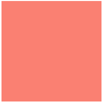
First I started by setting up a div with height and width:
HTML:
<div class="tri-up"></div>
CSS:
.tri-up {

width: 200px;

height: 200px;

background: #fa8071;

}
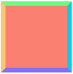
Then, I added thick borders. This is going to help us see how the triangles start to form:
CSS:
border-top: 15px solid #70fa80;

border-right: 15px solid #08cde7;

border-bottom: 15px solid #8070fa;

border-left: 15px solid #fac570;
Next, I took away the width and height of the box. Check out what happens:
CSS:
width: 0;

height: 0;
So cute!
Now lets get the triangle facing up. To do this we will make the background and all but the bottom border transparent:
Final CSS:
.tri-up {

width: 0;

height: 0;

margin: 0 auto;

border-top: 15px solid transparent;

border-right: 15px solid transparent;

border-bottom: 15px solid #8070fa;

border-left: 15px solid transparent;

}
Here is what you end up with!
Take a look at my live demo and play with the border-width on the transparent borders to get some interesting changes.
Live Demo
Thank you Chris and the comments for making this understandable.
Also, Check out Chris’s lovely animation.