Today we are going to take a quick look at CSS triangles. They can be used for various visual elements. Menu indicators, speech bubbles, and so much more. Plus, they are so cute and really fun to play with!
This is the goal object, a little purple CSS triangle:
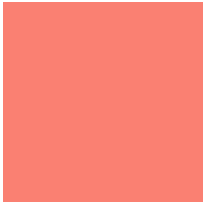
First I started by setting up a div with height and width:
HTML:
<div class="tri-up"></div>
CSS:
.tri-up {

width: 200px;

height: 200px;

background: #fa8071;

}
Then, I added thick borders. This is going to help us see how the triangles start to form:
CSS:
border-top: 15px solid #70fa80;

border-right: 15px solid #08cde7;

border-bottom: 15px solid #8070fa;

border-left: 15px solid #fac570;
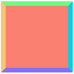
Next, I took away the width and height of the box. Check out what happens:
CSS:
width: 0;

height: 0;
So cute!
Now lets get the triangle facing up. To do this we will make the background and all but the bottom border transparent:
Final CSS:
.tri-up {

width: 0;

height: 0;

margin: 0 auto;

border-top: 15px solid transparent;

border-right: 15px solid transparent;

border-bottom: 15px solid #8070fa;

border-left: 15px solid transparent;

}
Here is what you end up with!
Take a look at my live demo and play with the border-width on the transparent borders to get some interesting changes.
Live Demo
Thank you Chris and the comments for making this understandable.
Also, Check out Chris’s lovely animation.